You can now analyze the results of Rogaining events using NaviTabi (※ As of January 2025, only the iOS version of the app is supported).
The result analysis function can be used by subscribing to the event organizer plan. Some functions can also be used for free.
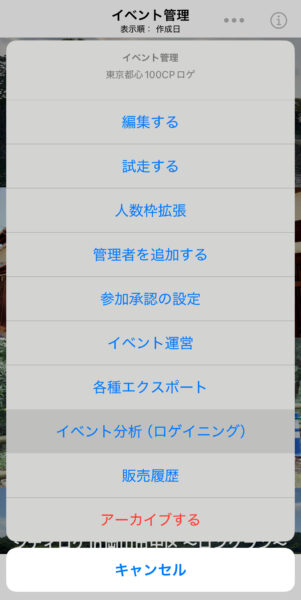
Available Analysis:
- Number of visits to each checkpoint (CSV output, graph display on map)
- Number visited as the first checkpoint (CSV output, graph display on map)
- Number visited as the first and second checkpoints (CSV output only)
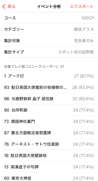
Number of Visits to Each Checkpoint
Select a course and category to tally up how many participants visited each checkpoint.
You can choose to tally up either “Finishers only” or “DNFs included”.
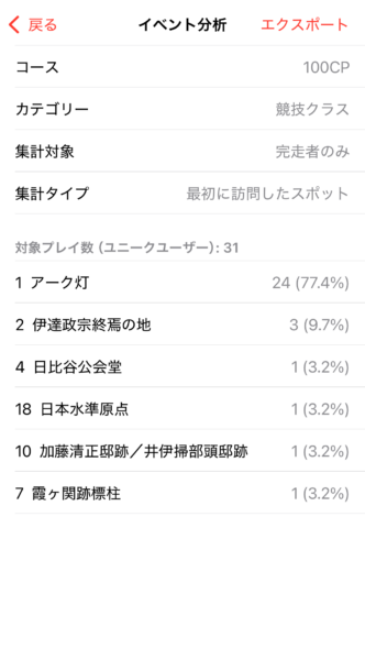
Number Visited as the First Checkpoint
Similarly, select the course, category, and whether to include DNF or only finishers to compile, and then tally up how many participants visited which checkpoint first.
CSV Export
The results can be exported as CSV files.
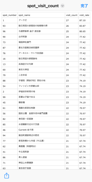
Viewing on Maps and Graphs and Exporting
The results can be displayed on a map as a pie chart or bubble chart.
The size and opacity of the circles can be adjusted.
The map can be exported as a PDF file.
Pie Chart
The red part of the pie chart for each checkpoint represents the visit rate, and the white numbers represent the points allocated.
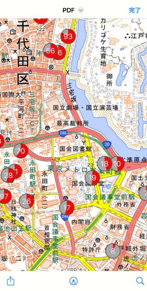
Bubble Chart
The visit rate of each check point is shown as the area of the pie.
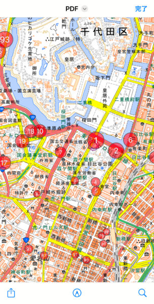
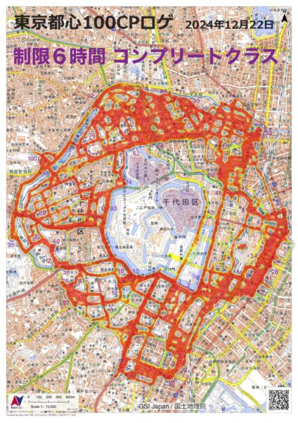
Appendix: Heatmap (not currently available via app)
It is possible to create a heat map based on the location information of participants obtained through the NaviTabi app.
There is currently no function to create a heat map directly within the app, but we will provide for a fee upon request.
